

#
UDTestimonial Powershell Universal Component Module 💖


This is the underlying component which made all this possible:-
You can get yourself a copy of this module on the Powershell Gallery:-
Here is the GitHub repository to this module which also includes all the project directories and files associated in the building of this component:-
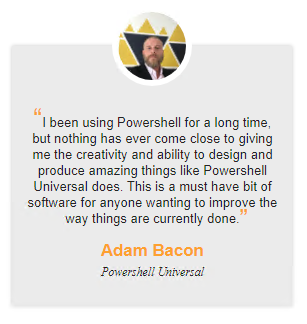
A simple PNG showing the component on a Powershell Universal dashboard:-

#
Showing my appreciation

So as I been using this product since it first came out, I thought this is something else that is missing. Like yeah I could have done this using New-UDCard but isn't it nicer when pretty much all the work is done already, and you have to just add the finishing touches?
I totally get that some people may think this is over-kill, but I think it is another great feature to add to an already abundant choice of components built into the product.
It is only human nature to be happy when someone else is happy about the thing you have done. Personally I have received thanks from various people in the Powershell community. These were proud moments knowing I done something good. So why not celebrate that goodness with a react component.
One person I really want to give my thanks to, and really who this component was designed for is Adam Driscoll. He made all this possible, and I know there is a thriving community behind this software, but again personally I do not feel enough people are giving appreciation, for just how amazing this is, and the endless possibilities it gives you. So here is my thanks Adam Driscoll you the man!
#
Demo Dashboard 👇
New-UDDashboard -Title 'UDTestimonial' -Content {
    New-UDRow -Columns {
    New-UDColumn -Content {
        New-UDStyle -Style '
        .jss1 {
         background: #b3b3ff;
         box-shadow: 3px 3px 9px #000000;
         border-radius: 12px;
        }
            .jss2 {
    top: -64px;
    width: 140px;
    height: 140px;
    z-index: 1;
    background-color: white;
    padding: 20px;
}
        .jss3 {
            width: 120%;
            height: 120%;
        }
        .jss5 h3 {
            color: #3314dd;
        }
        .jss4 > p:before {
            color: #3314dd;
            font-size: 3rem;
            float: left;
            padding-top: 5px;
        }
        .jss4 > p {
    margin: 0;
    line-height: 20px;
    padding-top: 25px;
}
        .jss4 > p:after {
            color: #3314dd;
            font-size: 3rem;
            padding-top: 8px;
            padding-left: 10px;
        }
        .jss4 {
                font-weight: bold;
                font-family: emoji;
        }
        .jss5 p {
            font-size: 1.2rem;
            font-weight: bold;
            font-style: inherit;
        }
        ' -Content {
New-UDTestimonial -Name "Adam Bacon" -Image "https://adam-bacon.netlify.app/imgs/me.jpg" -Text "I been using Powershell for a long time, but nothing has ever come close to giving me the creativity and ability to design and produce amazing things like Powershell Universal does. This is a must have bit of software for anyone wanting to improve the way things are currently done." -Project "Powershell Universal"
        }

} -LargeSize 4
  New-UDColumn -Content {
      New-UDTestimonial -Name "Adam Bacon" -Image "https://adam-bacon.netlify.app/imgs/me.jpg" -Text "I been using Powershell for a long time, but nothing has ever come close to giving me the creativity and ability to design and produce amazing things like Powershell Universal does. This is a must have bit of software for anyone wanting to improve the way things are currently done." -Project "Powershell Universal"
  } -LargeSize 4
}
}
I just tweaked some CSS attributes to get the desired look I was after which is shown in the first picture.
#
Please look at New-UDStyle
As you may have spotted, in the demo dashboard I have used two New-UDTestimonial objects however they look quite different, how is this possible? By using the built-in New-UDStyle to give me complete control over how the component displays. This is done by me being able to pass pure CSS as the Style being applied to the component specified in the Content.
So how did you know how to adjust just those CSS styles? Simple answer I didn't know. So how did you do it then?
Quite simple dear reader. I right clicked on the part of the component I was interested in, then selected inspect element. This then showed the developer tools of the CSS styles being applied. I then simply spent sometime tweaking the various values within the browser to see the immediate effects of the values I was changing. Once happy with the changes, I copied the rule from the browser and then pasted it into the style parameter of New-UDStyle. Yeah I did spend a bit of time figuring these exact settings out, but to me this is now looking exactly how I wanted it to look.
Again I could have possibly included the CSS as properties within the JSX component file. However I want to encourage users of this software to try to learn new skills, look at playing with CSS values and adding new properties and values, to end up with the desired result you are after.
Originally I thought the component looked nice enough, but I know what I may think is nice, someone else might think is garbage, until you can tweak it enough to their pleasing. I have said it enough times, but that is why I think the possibilities with this software are limitless. You can really do what-ever it is you want.
#
The Project 🏗️
This is the final version of the component JSX file:-
import React from 'react';
import TestimonialCard from 'material-testimonial-card';
import { withComponentFeatures } from 'universal-dashboard';

const UDTestimonial = props => {
  return (
  <div key={props.id}>
    <TestimonialCard
        name={props.name}
        image={props.image}
        content={props.content}
        project={props.project}
    />
  </div>
  );
}

export default withComponentFeatures(UDTestimonial)
I was feeling on a bit of a roll, as I had just finished building the New-UDFAQ module. As this particular component had zero dependencies, and was easy enough for me to understand. This literally did not take very long at all from start to finish. In-fact customising the CSS was the longest thing about this project.
#
Powershell Function 🤓
To make the actual cmdlet behind this component you need to edit the pre-defined function in the .PSM1 file so this is my finished .PSM1 before running the invoke-build
$IndexJs = Get-ChildItem "$PSScriptRoot\index.*.bundle.js"
$AssetId = [UniversalDashboard.Services.AssetService]::Instance.RegisterAsset($IndexJs.FullName)

function New-UDTestimonial {
    <#
    .SYNOPSIS
    Creates a new component

    .DESCRIPTION
    Creates a new component

    .PARAMETER Id
    The ID of this editor

    .PARAMETER Name
    The name to be displayed who the testimonial is from this is a string parameter

    .PARAMETER Image
    The image to be displayed who the testimonial is from this is a string parameter

    .PARAMETER Text
    Main testimonial text for the component, this is a string parameter

    .EXAMPLE
    New-UDTestimonial -Name "Adam Bacon" -Image "https://adam-bacon.netlify.app/imgs/me.jpg" -Text "I been using Powershell for a long time, but nothing has ever come close to giving me the creativity and ability to design and produce amazing things with Powershell Universal. This is a must have bit of software for anyone wanting to improve the way things are currently done." -Project "Powershell Universal"
    #>

    param(
        [Parameter()]
        [string]$Id = (New-Guid).ToString(),
        [Parameter()]
        [string]$Name,
        [Parameter()]
        [string]$Image,
        [Parameter()]
        [string]$Text,
        [Parameter()]
        [string]$Project
    )

    End {
        @{
            assetId = $AssetId
            isPlugin = $true
            type = "udtestimonial"
            id = $Id

            name = $Name
            image = $Image
            content = $Text
            project = $Project
        }
    }
}
Read The Help
Even if you just glanced through the above code, you should hopefully notice that I did include a decent help file for each parameter so here is the help just on the parameters
There are only four additonal parameters in total. The Name parameter, this will be displayed at the bottom, this is the name of who has given the testimonial. The Image parameter allows you to specify a string path to an image, I choose to use a URL. The Text parameter is the main text that will be displayed on the testimonial card. Last but not least is the Project parameter which is the project the testimonial refers to, this appear underneath the name displayed within the testimonial card.
#
CSS Breakdown
        .jss1 {
         background: #b3b3ff;
         box-shadow: 3px 3px 9px #000000;
         border-radius: 12px;
        }
            .jss2 {
    top: -64px;
    width: 140px;
    height: 140px;
    z-index: 1;
    background-color: white;
    padding: 20px;
}
        .jss3 {
            width: 120%;
            height: 120%;
        }
        .jss5 h3 {
            color: #3314dd;
        }
        .jss4 > p:before {
            color: #3314dd;
            font-size: 3rem;
            float: left;
            padding-top: 5px;
        }
        .jss4 > p {
    margin: 0;
    line-height: 20px;
    padding-top: 25px;
}
        .jss4 > p:after {
            color: #3314dd;
            font-size: 3rem;
            padding-top: 8px;
            padding-left: 10px;
        }
        .jss4 {
                font-weight: bold;
                font-family: emoji;
        }
        .jss5 p {
            font-size: 1.2rem;
            font-weight: bold;
            font-style: inherit;
        }
The .jss1 is refering to the main card where I am setting the colour of the main card, the box-shadow settings to be applied to the main card, and finally rounding those sharp corner edges.
The .jss5 h3 is refering to the name being displayed, so I have set the colour from the default orange it applies to this custom blue colour.
The .jss2 and .jss3 both refer to the image that is displayed in the middle at the top of the card. The size, padding, positioning and a few other options were set here, to make the picture display slightly bigger than the default settings.
The .jss4 > p:before and .jss4 > p:after refer to the speech marks enclosing the main text within the card. A few changes were made here to get the position and font looking how I wanted it to look.
The .jss4 > p is refering to the main text part being displayed on the card and the .jss4 refering to the speech marks surrounding the main text
The .jss5 P is refering to the Project parameter text you specified, which will appear at the very bottom of the card.
#
MarketPlace link