#
UDFullScreen Powershell Universal Component Module 📺

This is the underlying component which made all this possible:-
You can get yourself a copy of this module on the Powershell Gallery:-
Here is the GitHub repository to this module which also includes all the project directories and files associated in the building of this component:-
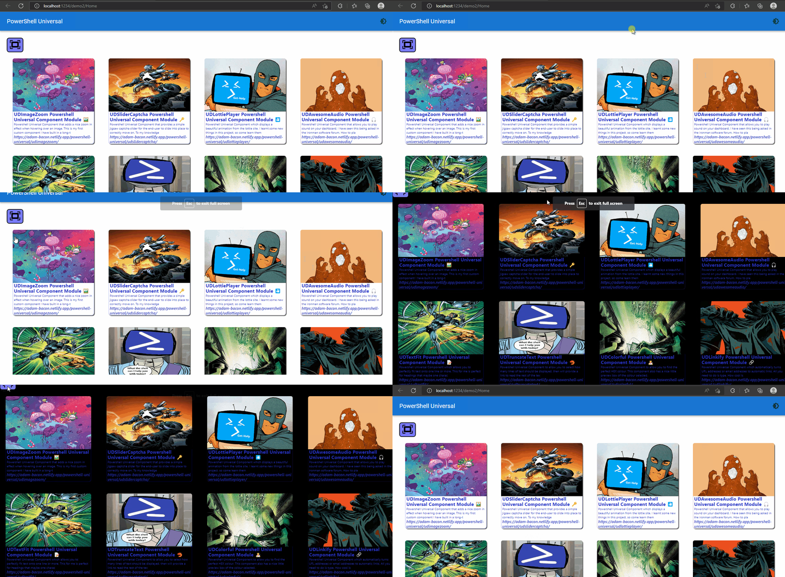
A simple GIF showing the component in action on a Powershell Universal dashboard:-
#
Super Sunday 😏
So what makes this a Super Sunday..? Well apart from it being the local car-boot which I do enjoy going to, it is a super Sunday because I managed to get another component smashed for Powershell Universal and what makes this even better, is that this particular component was not even my idea.
See I got nominated shall we say by a fellow Powershell Universal user. I have worked with this chap before on the google chart components I did a good while back, and I think he is a sound bloke. Just to get the feel for the true bromance on the forums going on then check out the origins of this component request right here:-
Not sure if like me when you was really young, you had mates that would double-dare you to do something potentially dangerous, just so they could see if it was safe for themselves to do. Although I did not feel any danger was directly involved with this, I did feel like it was a double-dare moment from childhood past.
Once I got the component confirmed it was time to put on my mask and cape, and go make something awesome. Or that was the plan. The link I was sent lead me to a GitHub repository right here:-
Looking at the readme provided I saw it was using the react-full-screen package. How did I know this, well it is shown right at the top of the JSX file you need to build
import { FullScreen, useFullScreenHandle } from "react-full-screen";
Next step was go check this package out, as I knew the exact name of the package I went to use npmjs.com and this lead me to the following page:-
Just Saying
Honestly it has been really tough to find useful components I believe are worthy of bringing to Powershell Universal, this is down to having built a load of custom components already in the past, and the fact there are now so many built-in components to choose from with-in Powershell Universal, that you are already spoilt for choice This was requested by the community hence I did this component.
#
I Have Never Thought About This 🧠

For me as I have said many times before, that this software Powershell Universal gives you unlimited possiblities on what you can do and display with the code you produce. The product has matured a lot since it was first released, and as mentioned before has a thriving community behind the product, who like me love using it. So as this product has been about for a good few years now, over that time-period various requests and moving to a new React component library Material-UI a lot more components have come as standard out-the-box.
I really do believe this is a magical bit of software to give you that opportunity to express yourself through the code you write. I am not a web-designer by trade, I have dabbled in doing bits here and there, and maintaining IIS servers. However I have never been employed as a front-end designer. So for me to try and start coding that sort of thing would take a lot of time to learn new tricks, and for me would go against just using Powershell cmdlets for the dashboards I build. What I am on about it the exact component I just built.
Just to prove anything is possible I took on the challenge of building this component to use within Powershell Universal. It is a bit odd, as I have not thought of building a full-screen component. Like probably just thinking I did not know one existed. It just does not come-up in the search results I get when looking for components. However it is an exceedingly good idea 💡 to have an option to display stuff in full screen, especially if you are displaying the amazing dashboard you built on a TV on the wall, or you want to give a presentation on your dashboard, then yeah this is the component for you.
#
Package Problems 🥺

Getting the package dependencies was not the issue, as this pacakge only needed two additional pacakages to make the component work. The issue was I could not get the component to originally work after building it from the demo-code supplied on npmjs. So as you probably know the internet can bee a great tool to turn to when you need a different example of the code. So I turned to codesandbox and I found this particular demo:-
Using this example I was able to get a fully working version of the component, based on this demo code supplied in the link above.
I wanted to customise the component a little, just to add my sprinkle of uniqueness to it. So instead of using the button icon from the code I ended up using the react-icons and selecting the full-screen and normal-screen icons from this package. I then added props to the CSS styling to allow you as the end-user to the customise the full-screen and normal-screen buttons to your exact needs as parameters.
However now the problem was I could only display text in this component. Like I could not figure out how I was going to bind child Powershell Universal components to this component. This was doing my head-in as I was so close to the finish-link, but this would not be a great component if you could only display static text in full-screen mode it kind of goes against the whole-point of these dashboards being able to display beautiful content if you cannot view them in the full-screen mode, but only boring plain static text.
#
Don't Give Up 😫
It is too easy in life to give up if something does not work out first-time. Not just in coding, but in general. I guess that is why we have become such a throw-away society, as you can just replace things, and give-up on them, instead of trying to figure out what is wrong with it.
I did not manage to get the content displaying within the component the first-time. Would of been easy to say nope it is not possible. But I knew this could be possible, I just did not quite know how. I tried some usual methods I thought would work, but each time it kept failing.
Not sure what caused this spark in my brain but I thought why not look at the universal-dashboard node package that is used as part of the build process. Behold there was a readme that contain this golden nugget of information
render (function)
This function is used to render other Universal Dashboard components. This might be handy if you support child components for your component.
const MyComponent = props => {
    return props.children.map(x => props.render(x))
}

export withComponentFeatures(MyComponent);
Okay so now I had this bit of information time to make it work...Well not being a react developer this seemed slightly harder than I first expected, as I was trying to call it using
{props.children.map(x => props.render(x))}Where I wanted the content to be displayed, however this just did not work. I did not want to give-up but I needed to go to bed as was already early-hours of Sunday morning by this point.
#
Eureka Moment 🎆
I was just getting ready to set off on a long drive, and just wanted to update the thread on this topic on the forum. Not sure why I did not think about this Saturday but thought there must be an example of how this is done on the installation I have on the Cloud machine I am running this off of. Searching around in the location you install Powershell Universal I was able to find the associated .MAP files for the components in use. Now again I do not know for like sure, but I believe the map file just compresses the output to remove any white-space and just give you just the guts-and-bones without all the pretty formatting. So this was not the easiest thing to read, but reading it gave me the exact answer I needed
{UniversalDashboard.renderComponent(props.content)}I could not believe my luck. The render component was mentioned in that readme I found but this was showing me how it was used in an official component to link child Powershell Universal components.
#
Final JSX File 🏁
Wow just one-line of code can make all the difference to a project. This is how my final JSX file for this component looks, which now allows you to bind child Powershell Universal components within this component.
import React, { useCallback } from 'react';
import { FullScreen, useFullScreenHandle } from "react-full-screen";
import { withComponentFeatures } from 'universal-dashboard';
import { GoScreenFull } from "react-icons/go";
import { GoScreenNormal } from "react-icons/go";
const UDFullScreen = props => {

  const handle = useFullScreenHandle();
  return (
    <div key={props.id} className="UDFullScreen">
      <button onClick={handle.enter} style={{ ['background-color']: props.buttonColor, ['border-radius']: "8px" }}>
        <GoScreenFull style={{height: props.heightFull, width: props.widthFull}}/>
      </button>
      <FullScreen handle={handle}>
          {handle.active && (
            <button onClick={handle.exit} style={{ ['background-color']: props.buttonScolor, ['border-radius']: "8px" }}>
              <GoScreenNormal style={{height: props.heightNormal, width: props.widthNormal}}/>
            </button>
          )}
       {UniversalDashboard.renderComponent(props.content)}
      </FullScreen>
    </div>
  );
}

export default withComponentFeatures(UDFullScreen)
#
Demo Dashboard 👇
I was really happy with the dashboard I had designed for my last blog post. So why not just use this same dashboard to this demo, but with a slight twist.
That twist is basically nesting that entire dashboard I did in my previous blog, as the -Content to be displayed as the content of the full-screen.
New-UDDashboard -Title 'PowerShell Universal' -Content {

New-UDFullScreen -Content {
New-UDRow -Columns {
New-UDColumn -Content {

New-UDFullScreen -URL "https://adam-bacon.netlify.app/powershell-universal/udimagezoom/"
} -LargeSize 3
New-UDColumn -Content {
New-UDFullScreen -URL "https://adam-bacon.netlify.app/powershell-universal/udslidercaptcha/"
} -LargeSize 3
New-UDColumn -Content {
New-UDFullScreen -URL "https://adam-bacon.netlify.app/powershell-universal/udlottieplayer/"
} -LargeSize 3
New-UDColumn -Content {
New-UDFullScreen -URL "https://adam-bacon.netlify.app/powershell-universal/udawesomeaudio/"
} -LargeSize 3
New-UDColumn -Content {
New-UDFullScreen -URL "https://adam-bacon.netlify.app/powershell-universal/udtextfit/"
} -LargeSize 3
New-UDColumn -Content {
New-UDFullScreen -URL "https://adam-bacon.netlify.app/powershell-universal/udtruncatetext/"
} -LargeSize 3
New-UDColumn -Content {
New-UDFullScreen -URL "https://adam-bacon.netlify.app/powershell-universal/udcolorful/"
} -LargeSize 3
New-UDColumn -Content {
New-UDFullScreen -URL "https://adam-bacon.netlify.app/powershell-universal/udlinkify/"
} -LargeSize 3
New-UDColumn -Content {
New-UDFullScreen -URL "https://adam-bacon.netlify.app/powershell-universal/udscrollprogress/"
} -LargeSize 3
New-UDColumn -Content {
New-UDFullScreen -URL "https://adam-bacon.netlify.app/powershell-universal/udtextloop/"
} -LargeSize 3
New-UDColumn -Content {
New-UDFullScreen -URL "https://adam-bacon.netlify.app/powershell-universal/udwizardry/"
} -LargeSize 3
New-UDColumn -Content {
New-UDFullScreen -URL "https://adam-bacon.netlify.app/powershell-universal/udreadtime/"
} -LargeSize 3
New-UDColumn -Content {
New-UDFullScreen -URL "https://adam-bacon.netlify.app/powershell-universal/udfaq/"
} -LargeSize 3
New-UDColumn -Content {
New-UDFullScreen -URL "https://adam-bacon.netlify.app/powershell-universal/udtestimonial/"
} -LargeSize 3
}
}
}
#
Powershell Function 🤓
To make the actual cmdlet behind this component you need to edit the pre-defined function in the .PSM1 file so this is my finished .PSM1 before running the invoke-build
$IndexJs = Get-ChildItem "$PSScriptRoot\index.*.bundle.js"
$AssetId = [UniversalDashboard.Services.AssetService]::Instance.RegisterAsset($IndexJs.FullName)

function New-UDFullScreen {
    <#
    .SYNOPSIS
    Creates a new component giving full screen ability

    .DESCRIPTION
    Adds a button, to which you then add content, all then content within this function will then display in a full screen mode when the full-screen button is clicked

    .PARAMETER Id
    The ID of this editor

    .PARAMETER ButtonFullScreenColor
    Enables you to set the color of the full-screen button, this is a string and defaulted to #7a7aff

    .PARAMETER ButtonFullScreenHeight
    Sets the height for the full-screen button. Defaulted to 3em

    .PARAMETER ButtonFullScreenWidth
    Sets the width for the full-screen button. Defaulted to 3em

    .PARAMETER ButtonNormalScreenColor
    Enables you to set the color of the normal-screen button, this is a string and defaulted to #7a7aff

    .PARAMETER ButtonNormalScreenHeight
    Sets height for the normal screen button, defaulted to 3em

    .PARAMETER ButtonNormalScreenWidth
    Sets width for the normal screen button, defaulted to 3em

    .PARAMETER Content
    Is a mandatory scriptblock parameter, to allow you to nest other dashboard components you want to display in full-screen
    .EXAMPLE
    New-UDFullScreen -Content { "Everything in content block will be full screen when button clicked" }
    #>

    param(
        [Parameter()]
        [string]$Id = (New-Guid).ToString(),
        [Parameter()]
        [string]$ButtonFullScreenColor = "#7a7aff",
        [Parameter()]
        [string]$ButtonFullScreenHeight = "3em",
        [Parameter()]
        [string]$ButtonFullScreenWidth = "3em",
        [Parameter()]
        [string]$ButtonNormalScreenColor = "#7a7aff",
        [Parameter()]
        [string]$ButtonNormalScreenHeight = "3em",
        [Parameter()]
        [string]$ButtonNormalScreenWidth = "3em",
        [Parameter(Mandatory)]
        [scriptblock]$Content
    )

    End {
        @{
            assetId      = $AssetId
            isPlugin     = $true
            type         = "udfullscreen"
            id           = $Id

            buttonColor  = $ButtonFullScreenColor
            heightFull   = $ButtonFullScreenHeight
            widthFull    = $ButtonFullScreenWidth
            buttonScolor = $ButtonNormalScreenColor
            heightNormal = $ButtonNormalScreenHeight
            widthNormal  = $ButtonNormalScreenWidth
            content      = $Content.Invoke()

        }
    }
}
Read The Help
Even if you just glanced through the above code, you should hopefully notice that I did include a decent help for each parameter most parameters are for styling the buttons, think of this component like a New-UDCard component, anything you embed within the -content parameter will be displayed in full screen
#
MarketPlace link 🤫
