#
UDLinkPreview Powershell Universal Component Module 🎁
This is the underlying component which made all this possible:-
You can get yourself a copy of this module on the Powershell Gallery:-
Here is the GitHub repository to this module which also includes all the project directories and files associated in the building of this component:-
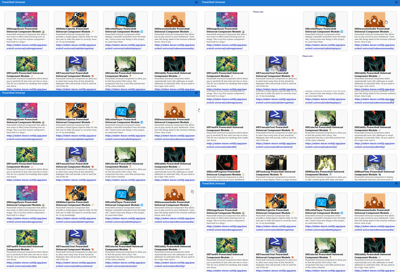
A simple GIF showing the component in action on a Powershell Universal dashboard:-
#
Happy Friday 😏

Yes it is Friday the end of the working week for most office-based individuals. So I heard this phrase being bumped about recently Happy Friday. So what better way to appreciate a Happy Friday is with a brand-new Powershell Universal Component.
I worked out recently using the blog I have done and the dates recorded on them, that I have built 15 Powershell Universal Modules in the last 20 days. So I only had 5 modules I missed out on for a module a day. I thought that was a pretty amazing fact to share with you all.
Possibly the 5 days were spent searching for a component that did not exist already. Like I nearly built the syntax highlighter to only then search the Powershell Universal Market-Place to find out it had already been done by Adam Driscoll so there was no need to build that. I looked at animation, then I discover in the new documentation that animation now comes built-in, so again there was no need.
Honestly it has been really tough to find useful components I believe are worthy of bringing to Powershell Universal, this is down to having built a load of custom components already in the past, and the fact as I mentioned in the last paragraph and previous blogs there are now so many built-in components to choose from with-in Powershell Universal, that you are already spoilt for choice
#
Why Build Custom Components? 🧠
For me as I have said many times before, that this software Powershell Universal gives you unlimited possiblities on what you can do and display with the code you produce. The product has matured a lot since it was first released, and as mentioned before has a thriving community behind the product, who like me love using it. So as this product has been about for a good few years now, over that time-period various requests and moving to a new React component library Material-UI a lot more components have come as standard out-the-box.
I really do believe this is a magical bit of software to give you that opportunity to express yourself through the code you write. I am not a web-designer by trade, I have dabbled in doing bits here and there, and maintaining IIS servers. However I have never been employed as a front-end designer. So for me to try and start coding that sort of thing would take a lot of time to learn new tricks, and for me would go against just using Powershell cmdlets for the dashboards I build. What I am on about it the exact component I just built.
Said it before so will say it again, but I really am amazed at the feed-back I have had from this personal blog website, and the opportunites it has presented, as well as playing a part in helping me land this new dream-job. I have been sharing various links from this site on Twitter and LinkedIn to share what I have been working on to bring new modules to Powershell. Each time you share a hyperlink on a social-media site it will automatically turn that hyperlink into a preview link showing you a picture from the site, and a bit of information on the page, the domain and a link. Again I am not a web-designer by trade, or front-end designer, but this to me is really, really cool.
I know this product has New-UDLink to be able to display hyperlinks, but having shared a lot of links recently on social-media sites I really do like the link preview that automatically happens when you share a link. As in a bit of information about that particular hyperlink is automatically displayed like the domain, a picture or media, and some information on that webpage the link leads to. This to me is really nice it turns plain text hyperlink into something that looks much more attractive. It also personally gives me a bit more confidence about the link I am clicking on, and the type of webpage I expect to land on after clicking the link.
So for me this is a prime opportunity to bring this feature of a link preview to the mighty Powershell Universal to expand the eco-system of components, and giving end-users more choice on things you can do with this software. I do not know why more community members do not get building custom components? As all the information on how-to do this is out there, and I am really hoping these blogs will inspire some others to have a go at creating a custom component they want for their dashboard.
Like I could have done some Powershell scripting to obtain this information, by writing a function and placing that within the dashboard, and display this information on an existing component such as New-UDCard and achieving the same or similar results. I do not like to think of this as taking a short-cut (as this particular component took me a lot longer than anticipated to complete) to writing a Powershell function, for me it is like why am I going to re-invent-the-wheel if the wheel already exists. In this scenario the wheel is the link preview component I was sure that one would exist that I could use, and further-more by building this as a dedicated component, it makes it far-easier for other Powershell Universal users to use this.
#
Package Problems 🥺

Before selecting a component to build I like to actually look at the read me to find out more about the component and the props (parameters) I can pass to the component. First-off the choice was more limited to what I was expecting, the majority of the packages were all forked from one-particular package.
I tried numerous variants of these packages and the official package they were based on, but it seemed very hit-and-miss with the results. Like the component would work, I would tweak a CSS setting in the main project file, and then it would stop working, then possible start working after a good amount of time, or have issues displaying multiple cards. I almost got annoyed by the process, as I was thinking it had something to do with existing node packages. Like the time to load the actual end result seemed to also vary a great deal. Sometimes it would just be stuck on the CSS loading bit, and it would only become evident that there was an issue when looking into the developer browser tools to see there was an error, and that link I had parsed was never going to be retrieved.
Only after reading a full article on on of the forked packages I noticed they had a small section saying if using this for to display URLs then it can be very sparodic on the results. Damn I wish I had of read all the articles from start to finish as I only normally look at the code section and the prop section. So it was not me or me changing the code, it was the end API server being at fault. I mean some of the packages I tried did not even have an API configured. There was also a section on how you could configure and install your own server to be able to fetch the preview link information. Wow this was starting to become over-kill even for me. I looked on the internet briefly for an API server but these all seemed to either require you to sign up for a key, and then was limited to a certain number before it came a paid-for-service.
As always I did not want to stop once I got started looking at this component. I think I tweaked my search-phrase I was using to find this component a little then I found a preview link component, that also offered you a link to the API server it was using which allowed me to test to see how reliable the results were. This seemed fantastic, and exactly what I was looking for first time round, after having already spent a good number of hours trying and customising numerous node packages for this project, only to find they did not work, or were too un-reliable to release as a component.
This is why this particular project took me a lot longer than I originally anticipated. As finding a package which ticked all the boxes and was also very reliable seemed near impossible. Thankfully I did not give-up on that challenge and kept persevering until the end.
#
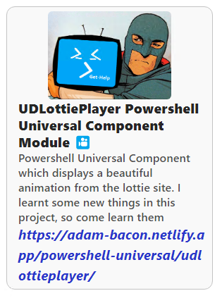
Demo Dashboard 👇
New-UDDashboard -Title 'PowerShell Universal' -Content {

New-UDRow -Columns {
New-UDColumn -Content {

New-UDLinkPreview -URL "https://adam-bacon.netlify.app/powershell-universal/udimagezoom/"
} -LargeSize 3
New-UDColumn -Content {
New-UDLinkPreview -URL "https://adam-bacon.netlify.app/powershell-universal/udslidercaptcha/"
} -LargeSize 3
New-UDColumn -Content {
New-UDLinkPreview -URL "https://adam-bacon.netlify.app/powershell-universal/udlottieplayer/"
} -LargeSize 3
New-UDColumn -Content {
New-UDLinkPreview -URL "https://adam-bacon.netlify.app/powershell-universal/udawesomeaudio/"
} -LargeSize 3
New-UDColumn -Content {
New-UDLinkPreview -URL "https://adam-bacon.netlify.app/powershell-universal/udtextfit/"
} -LargeSize 3
New-UDColumn -Content {
New-UDLinkPreview -URL "https://adam-bacon.netlify.app/powershell-universal/udtruncatetext/"
} -LargeSize 3
New-UDColumn -Content {
New-UDLinkPreview -URL "https://adam-bacon.netlify.app/powershell-universal/udcolorful/"
} -LargeSize 3
New-UDColumn -Content {
New-UDLinkPreview -URL "https://adam-bacon.netlify.app/powershell-universal/udlinkify/"
} -LargeSize 3
New-UDColumn -Content {
New-UDLinkPreview -URL "https://adam-bacon.netlify.app/powershell-universal/udscrollprogress/"
} -LargeSize 3
New-UDColumn -Content {
New-UDLinkPreview -URL "https://adam-bacon.netlify.app/powershell-universal/udtextloop/"
} -LargeSize 3
New-UDColumn -Content {
New-UDLinkPreview -URL "https://adam-bacon.netlify.app/powershell-universal/udwizardry/"
} -LargeSize 3
New-UDColumn -Content {
New-UDLinkPreview -URL "https://adam-bacon.netlify.app/powershell-universal/udreadtime/"
} -LargeSize 3
New-UDColumn -Content {
New-UDLinkPreview -URL "https://adam-bacon.netlify.app/powershell-universal/udfaq/"
} -LargeSize 3
New-UDColumn -Content {
New-UDLinkPreview -URL "https://adam-bacon.netlify.app/powershell-universal/udtestimonial/"
} -LargeSize 3
}
}
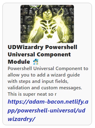
For me this was a super-simple way to design a very rich looking dashboard with information to various contents, that you have the chance to read about on the card displaying the link preview. I took the time to customise the original CSS file it was using to display the information. I did not pass these as props in the main component, this does not mean you cannot customise it to your requirements. It just means that you will have to use New-UDStyle to adjust the appearance if you do not like the look of the default appearance.
Again this process took a bit longer than I originally thought, as I really liked the look of certain displays, but then found this mis-aligned the height of some cards depending on the image. I could not decide where the picture would look best, as originally it was on the right-hand-side. Eventually I decided placing the image on the top of the link preview looked the nicest setting. I customised all the font-displays and certain colours, to give that nice easy read appeal to the font.
Weirdly, and this was the same for the other packages I had already spent hours testing, was that although you got a beautiful link preview and the cursor automatically changed to a hand cursor as if the item was able to be clicked, clicking on the link preview did nothing. So now faced another challenge that I needed this item to actually be a hyperlink as well, as to me it would only be half-a-job if you could not actually click on the link preview to visit the site. Thankfully this was not too difficult and is shown in the below JSX file I constructed to build this component
#
The Project 🏗️
This is the final version of the component JSX file:-
import React from 'react';
import { withComponentFeatures } from 'universal-dashboard';
import Preview from  'preview-url-component';
import './preview.css';

const UDLinkPreview = props => {
  return (
    <a href={props.url} style={{['text-decoration']: "none"}}>
    <Preview
        key={props.id}
        url={props.url}
        loadingText={props.loadingText}
        notFound={props.notFound}
    />
    </a>
);
}

export default withComponentFeatures(UDLinkPreview)
This particular component also offered two props which other components did not offer. This was custom loading text and custom page not found text which would also give the end-user more options for what they wanted displayed on the screen during this period of loading, or if the page could not be found, the appropriate text to be displayed. I done a good amount of testing with this package and not once have I had any issues with the content displaying, hence I have decided to release this as another custom component for Powershell Universal.
#
Powershell Function 🤓
To make the actual cmdlet behind this component you need to edit the pre-defined function in the .PSM1 file so this is my finished .PSM1 before running the invoke-build
$IndexJs = Get-ChildItem "$PSScriptRoot\index.*.bundle.js"
$AssetId = [UniversalDashboard.Services.AssetService]::Instance.RegisterAsset($IndexJs.FullName)

function New-UDLinkPreview {
       <#
    .SYNOPSIS
    Creates a link preview of the supplied hyperlink

    .DESCRIPTION
    Allows you to display a link preview of the URL you have provided to a given website. This is very similar to what you see on social-media sites when posting a hyperlink.

    .PARAMETER Id
    The ID of this editor

    .PARAMETER URL
    A full URL address of a website. This is a mandatory parameter

    .PARAMETER TextLoading
    Text to be displayed whilst the component is loading. Defaulted to Please wait...

    .PARAMETER TextNotFound
    Text to be displayed if the supplied URL cannot be found or the information cannot be retrieved. Defaulted to URL Not Found

    .EXAMPLE
    New-UDLinkPreview -URL "https://adam-bacon.netlify.app/powershell-universal/udtestimonial/"
    #>


    param(
        [Parameter()]
        [string]$Id = (New-Guid).ToString(),
        [Parameter(Mandatory)]
        [string]$URL,
        [Parameter()]
        [string]$TextLoading = "Please wait...",
        [Parameter()]
        [string]$TextNotFound = "URL Not Found"

    )

    End {
        @{
            assetId = $AssetId
            isPlugin = $true
            type = "udlinkpreview"
            id = $Id

            url = $URL
            loadingText = $TextLoading
            notFound = $TextNotFound
        }
    }
}
Read The Help
Even if you just glanced through the above code, you should hopefully notice that I did include a decent help file for each parameter so here is the help just on the parameters
There are only two additonal parameters to the one mandatory parameter. The code I provided for the demo dashboard shows me only using the one required mandatory parameter to display the beauty of this component to the end-user. I just wanted this to be as easy-as-possible to use, and produce amazingly good looking results, all from a plain looking hyperlink. I think that particular mission has now been accomplished.
#
MarketPlace link 🤫
