#
UDLottiePlayer Powershell Universal Component Module 🎦

#
Powershell Universal 🌎
If you read my last blog, then please feel free to skip these first few paragraph titles. I just want to re-emphasize how **amazing Powershell Universal is, and how it could change the way you code, and think about displaying your code. I have mentioned this a good few times in previous blogs that I really miss using Powershell Universal. I mean when I first got using this, it was just called Universal Dashboard. This then grew into a product offering three main features Jobs, APIs and Dashboards. This became Powershell Universal, read all about what it can do here:-
To me this product is just so amazing. Not only does it contain a huge amount of components for your dashboards, images, cards, accordians, buttons, select options, graphs and lots more the developer of this software also gave the opportunity to allow you as an end-user build custom components to extend the list of components that can be used.
Check out the demo instance of this software to get a feel for the main product portal where you can control all the super cool stuff you can do.
#
React Component 🔧
Yes I know I keep mentioning the word component but you may know this as a widget or self-contained application, or maybe a mini application to me a component does its own thing using its own bit of the webpage and can have certain parameters associated with it. So you could have a graph component that has a refresh button. Back in the old web days, this would refresh the whole webpage to then re-render the graph. Where-as a React component would just refresh that component, and anything else on the web-page would be un-affected by this refresh happening on the graph component. This is why to me they are isolated objects on the web-page all running in their own run-spaces.
Although Powershell Universal is like amazing, like so amazing. It is using that material-ui theme, and all the associated components with that theme. All the components for this react theme are listed here:-
So hopefully by now you know what I mean by the word component. If you are still confused then please check-out the official documentation for the components that are included into this product. Seriously this is well worth reading the documentation to understand this product more, as just like it was for me, all this was brand-new stuff to learn, and get my head around what these different components did, how they displayed on the screen, and how I could use them for particular parts of my dashboard.
#
Custom Component ⚒️
There are many places you can find custom react components that either individuals have built, or a team of people working together to build a component. One site I like to see custom react components on is npmjs.com there is also https://bit.cloud/ however I prefer to use:-
Seriously the react component library is massive, like really, really big. There are just so many components out there. Like looking at card components, hundreds are returned...but end of the day they are all card components...just a bit different looking (themed). So as always just like pretty much all my modules I try to produce I try to find something that does not already exist, and will hopefully benefit others. I remember a good few years back I looked at a captcha but it was too difficult to implement, and I am not an expert on tokens to verify, which it seemed all captcha components required. Still to this day there is no official captcha component for the official product. So to me this was a change to prove to my guardian angel I was back on the path to making things happen.
#
Lottie Player 🎥
First step was to go to www.npmjs.com to see what I could find on there. The great thing when looking to build components is that you can learn something new. So I never knew about this awesome website to obtain graphics from.
The style of these graphics reminded me of
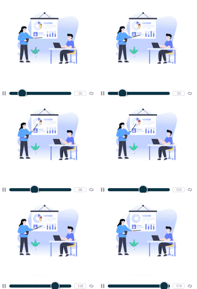
Which I have done two custom components for already on the Powershell Universal market place. However these graphics included movement, yeah you may think whoopy-doo it is just a GIF. No dear reader this is far more than just a GIF, check out the lottie files site for the evidence.
I always appreciate it when someone has the time to write good documentation on how to use something, and this component had just that, as well as a demo site showing you the component in action. Another great thing is this component had one more dependency, which did not have any sub-dependencies, meaning I only two npm node packages in order to build this component. This was a major blessing as well, as in the past I can remember some components, having lots and lots of dependencies, which will slow down the build process. The other super cool thing about this particular react component is the props aka parameters that are available. I have tried to include all of these in the end finished module.
#
Github Template 👾
The next section on building the custom component relies on you having a local copy of this repository which is a template you can use to convert any react component into a Powershell Universal dashboard component. I mean how amazing is that. You can convert something written in a completely different language and make it work with native Powershell commands, using Powershell. It still blows my mind how amazing this is, as now there so many possibilities on what you can now display in your dashboard.
#
Building The Component 🚧
There is an outline of how to build a custom component here:-
Further official documentation can also be found on the blog on the ironman software site. This documentation personally made more sense to me:-
Even though I had previously built a good amount I think 90+ custom components, that was using a different technique, as the software has since been updated to use a newer version of react, and so the build method changed. Honestly this change has given a ginormous improvement in the time it takes to build the custom component. When I was building these custom components on my x86 laptop, it was taking sometimes up to 20 minutes or longer to build the component depending on the amount of dependencies the component had. However using this new build technique it only takes about 5-10 seconds! Yes seconds not minutes, so using this new method is a massive time saver in itself.
#
Component JSX File 🗃️
So there are a fair few good files you need to edit in some shape or form to build a component, I think it would be a good idea for me to document this process to show how simple it really is. Before I could edit this JSX file within the components folder I needed to make sure I had installed the npm pacakge for this react component I did this by copying the command from npmjs.com
npm i @lottiefiles/react-lottie-player
npm i lottie-web
So once these were installed, and I had renamed the .PSD1 and .PSM1 file to the module name I wanted. I then edited the .PSD1 file to include the RootModule as the newly named .PSM1 file, I edited the component.build.ps1 file to copy the newly named modules
	Copy-Item $PSScriptRoot\UDLottiePlayer.psd1 $OutputPath
	Copy-Item $PSScriptRoot\UDLottiePlayer.psm1 $OutputPath
also edited line 20 in the webpack.config.js file to be
library: 'udlottieplayer'Within the components folder there is an index.js file my edited file looked like
import UDLottiePlayer from './component';
UniversalDashboard.register("udlottieplayer", UDLottiePlayer);
Please keep case-sensitive lower-case for the webpack.config.js file which then reflects what is typed as first arguement within the parenthesis as shown above. Once you have made all these edits to the existing template files, and installed the npm package and all dependencies (in this case I only had two packages to install as only one dependency) it is time to construct the actual component that will be displayed on the dashboard. This is done by editing the component.jsx file witin the components folder within the github template you downloaded. This is my final edited component.jsx file:-
 import React from 'react';
 import { withComponentFeatures } from 'universal-dashboard';
 import { Player, Controls } from '@lottiefiles/react-lottie-player';

 const UDLottiePlayer = props => {
  return <Player
  key={props.id}
  autoplay={props.autoplay}
  loop={props.loop}
  src={props.src}
  speed={props.speed}
  hover={props.hover}
  style={{ height: '300px', width: '300px' }}
  >
  <Controls visible={props.visible} buttons={['play', 'repeat', 'frame', 'debug']} />
 </Player>;
}

 export default withComponentFeatures(UDLottiePlayer)
So VSCode was not complaining about any of the code above, so now I needed to edit the .PSM1 and .PSD1 file to finish this component off before running invoke-build so this is my final PSD1 file below
#
# Module manifest for module 'UniversalDashboard.Component'
#
# Generated by: adam bacon
#
# Generated on: 03/09/2022
#

@{

# Script module or binary module file associated with this manifest.
RootModule = 'UDLottiePlayer.psm1'

# Version number of this module.
ModuleVersion = '1.0.2'

# Supported PSEditions
# CompatiblePSEditions = @()

# ID used to uniquely identify this module
GUID = '76de2c49-86a9-4b58-9247-edbe35fed09a'

# Author of this module
Author = 'psdevuk'

# Company or vendor of this module
CompanyName = 'Home'

# Copyright statement for this module
Copyright = '(c) adamr. All rights reserved.'

# Description of the functionality provided by this module
 Description = 'Lightweight, scalable animations for your dashboard, UDLottieplayer takes away the complexity from Motion Design'

# Minimum version of the PowerShell engine required by this module
# PowerShellVersion = ''

# Name of the PowerShell host required by this module
# PowerShellHostName = ''

# Minimum version of the PowerShell host required by this module
# PowerShellHostVersion = ''

# Minimum version of Microsoft .NET Framework required by this module. This prerequisite is valid for the PowerShell Desktop edition only.
# DotNetFrameworkVersion = ''

# Minimum version of the common language runtime (CLR) required by this module. This prerequisite is valid for the PowerShell Desktop edition only.
# ClrVersion = ''

# Processor architecture (None, X86, Amd64) required by this module
# ProcessorArchitecture = ''

# Modules that must be imported into the global environment prior to importing this module
# RequiredModules = @()

# Assemblies that must be loaded prior to importing this module
# RequiredAssemblies = @()

# Script files (.ps1) that are run in the caller's environment prior to importing this module.
# ScriptsToProcess = @()

# Type files (.ps1xml) to be loaded when importing this module
# TypesToProcess = @()

# Format files (.ps1xml) to be loaded when importing this module
# FormatsToProcess = @()

# Modules to import as nested modules of the module specified in RootModule/ModuleToProcess
# NestedModules = @()

# Functions to export from this module, for best performance, do not use wildcards and do not delete the entry, use an empty array if there are no functions to export.
FunctionsToExport = 'New-UDLottiePlayer'

# Cmdlets to export from this module, for best performance, do not use wildcards and do not delete the entry, use an empty array if there are no cmdlets to export.
CmdletsToExport = '*'

# Variables to export from this module
VariablesToExport = '*'

# Aliases to export from this module, for best performance, do not use wildcards and do not delete the entry, use an empty array if there are no aliases to export.
AliasesToExport = '*'

# DSC resources to export from this module
# DscResourcesToExport = @()

# List of all modules packaged with this module
# ModuleList = @()

# List of all files packaged with this module
# FileList = @()

# Private data to pass to the module specified in RootModule/ModuleToProcess. This may also contain a PSData hashtable with additional module metadata used by PowerShell.
PrivateData = @{

    PSData = @{

        # Tags applied to this module. These help with module discovery in online galleries.
        Tags = @('universaldashboard','ud-dashboard','Animation','JSON')

        # A URL to the license for this module.
        # LicenseUri = ''

        # A URL to the main website for this project.
         ProjectUri = 'https://github.com/psDevUK/UDLottiePlayer'

        # A URL to an icon representing this module.
        IconUri = 'https://raw.githubusercontent.com/psDevUK/UDLottiePlayer/main/UDLottiePlayer/UDLottiePlayer.gif'

        # ReleaseNotes of this module
        # ReleaseNotes = ''

        # Prerelease string of this module
        # Prerelease = ''

        # Flag to indicate whether the module requires explicit user acceptance for install/update/save
        # RequireLicenseAcceptance = $false

        # External dependent modules of this module
        # ExternalModuleDependencies = @()

    } # End of PSData hashtable

} # End of PrivateData hashtable

# HelpInfo URI of this module
 HelpInfoURI = 'https://github.com/psDevUK/UDLottiePlayer/blob/main/README.md'

# Default prefix for commands exported from this module. Override the default prefix using Import-Module -Prefix.
# DefaultCommandPrefix = ''

}
To make the actual cmdlet behind this component you need to edit the pre-defined function in the .PSM1 file so this is my finished .PSM1 before running the invoke-build
$IndexJs = Get-ChildItem "$PSScriptRoot\index.*.bundle.js"
$AssetId = [UniversalDashboard.Services.AssetService]::Instance.RegisterAsset($IndexJs.FullName)

function New-UDLottiePlayer {
    <#
    .SYNOPSIS
    Displays a Lottie Animation

    .DESCRIPTION
    Really nice JSON animations available using the lottie player animation JSON URLs can be obtained from  https://lottiefiles.com/ for free

    .PARAMETER Id
    The ID of this editor

    .PARAMETER AutoPlay
    Boolean value to determine if animation should auto-play or not default is true

    .PARAMETER Loop
    Boolean value to determine if animation should loop or not default is true

    .PARAMETER LottieURL
    Is a string value for the lottie animation url

    .PARAMETER Controls
    Boolean value to determine if the lottie player controls should be shown default is true

    .PARAMETER Hover
    Boolean value to determine if the animation should play on mouse hover default is false

    .EXAMPLE
    New-UDComponent -LottieURL "https://assets6.lottiefiles.com/packages/lf20_0zomy8eb.json"
    #>

    param(
        [Parameter()]
        [string]$Id = (New-Guid).ToString(),
        [Parameter()]
        [bool]$AutoPlay = $true,
        [Parameter()]
        [bool]$Loop = $true,
        [Parameter()]
        [string]$LottieURL,
        [Parameter()]
        [decimal]$Speed = 1,
        [Parameter()]
        [bool]$Controls = $true,
        [Parameter()]
        [bool]$Hover = $false
    )

    End {
        @{
            assetId  = $AssetId
            isPlugin = $true
            type     = "udlottieplayer"
            id       = $Id

            autoplay = $AutoPlay
            loop     = $Loop
            src      = $LottieURL
            speed    = $Speed
            visible  = $Controls
            hover    = $Hover
        }
    }
}
#
Ready, Steady, Go! 🚦
So once you have followed the above, you are now ready to run:-
invoke-buildAs long as you read the official documentation on building a custom component you would have already downloaded all the prerequisite modules and software required to build custom components. I did find I needed to also install the psake module as well. This process literally took 10 seconds or less. As long as you do not get any errors, and the process completes then within the output directory you will have you brand-new custom component you built. My output directory now contained the following four files index.b3e974780ae961d2bc5e.bundle.js,index.b3e974780ae961d2bc5e.bundle.map,UDLottiePlayer.gif,UDLottiePlayer.psd1,UDLottiePlayer.psm1. Next stage was to now test this in a simple dashboard, I made a directory called UDLottiePlayer within C:\Program Files\WindowsPowerShell\Modules* and copied these newly created files into this new folder directory **C:\Program Files\WindowsPowerShell\Modules\UDLottiePlayer*. I restarted the PowershellUniversal service then logged into the main portal. Verified the module was being picked up by the software, by searching the available modules within the program. Once I verified my new module was included, I then did a test on the dashboard.

I now had a fully working react custom component loaded into the Powershell Universal dashboard I had created. I then verified all the parameters worked, which they did then it was time to publish this module to the Powershell Gallery. Please note to include ud-component within the module tags to enable your custom component to be found on the market place exclusive to this product.


